drawing

LAZARUS: Number Sixteen

Lazarus: Sixteen Lazarus #16 is on stands now. This issue is a bold vignette in the eye of the narrative hurricane by Rucka & Lark, and expands its format to include a wealth of journalistic design work by Eric Trautmann as well as a few interstitial illustrations by me.
Lazarus: Sixteen
Lazarus: SixteenAbove are some of the process steps from early thumbnails, sketches and an alternate for the third act piece with a more digital fragmenting effect that was a fun experiment. Massive credit due to Eric for tying all the pages together so well, and thanks again to Greg and Michael and the team for the invitation to be part of the issue.
Lazarus: Sixteen
In related news, the original inks for this issue's cover (and others) are now available through Splash Page Comic Art. It's incredibly nice to be in such good company there as well. LAZARUS: Number Sixteen

Maxim: The Last Patrol

Maxim: The Last Patrol I've enjoyed a daily drawing practice for many years now. I keep a journal that includes observation studies, practice with different pens, brushes, etc., from both digital and traditional sketchbooks, all collected on instagram over recent years. It's a valuable regimen for me, and definitely something I feel if it's missing as the close of the day draws near.

Daily Drawing sketches
So getting a call to take an observational/sketchbook approach to an editorial assignment was a nice collision of worlds. The assignment came from AD David Zamdmer at Maxim. The feature was about Major James Capers, who has been repeatedly passed over for the Medal of Honor despite exceptional service and many commendations during the Vietnam War.
Maxim: The Last Patrol
The composition sketches above went through a number of iterations as the direction shifted from a darker jungle composition to a more open clearing framing the figures. The final piece was executed in the spirit of observational field sketches from a host of reference and documentary research, and drawn using a combination of Kyle Webster's great Photoshop drawing brushes. Maxim: The Last Patrol

The New Yorker: Gone Girl

The New Yorker: Gone Girl
I was out of town when I got the call asking about illustrating a piece on David Fincher's upcoming Gone Girl for The New Yorker, but by the time I was halfway through the walls-closing-in noire trailer I realized this was one of those assignments I was already sketching out ideas without having even said yes.
The New Yorker: Gone Girl
The great public specter looming over Affleck's character struck me as the stuff of great pulp covers, so the sketches began to take a turn towards the more theatrical devices of Norman Rockwell's "Razor's Edge" and Allesandro Biffignandi's "The Day the Sky Exploded." Ultimately, Rene Peron's graphically brilliant work on "The Passion of Joan of Arc," set the tone for the homage to the great pulp classics and cinema posters.The New Yorker: Gone Girl
The issue hits stands this week, and Christoph Niemann's cover is brilliant. Thanks as always to AD Chris Curry.

The New Yorker: Blue Bloods

The New Yorker: Blue Bloods
I love horseshoe crabs. It might be their quiet witness to half a billion years on earth, or the fact their hearts pump a singular amebocyte that defends their blood from pathogens, or the fact they can't be raised in captivity yet are preciously harvested by pharmaceutical companies. Horseshoe crabs are fascinating.

I wish I could claim that my interest in them predated the piece by Ian Frazier but it truly started after Christine Curry from the New Yorker sent me the article to illustrate. Once I read the story and began researching and drawing horseshoe crabs it was hard to stop. Below are some of the development sketches, exploring different ways to try to do these orthropods justice. Did I mention they swim upside down?
The New Yorker: Blue Bloods

Mother Jones: 780 Days of Solitude

Mother Jones: 780 Days of Solitude Illustrators and artists working in black and white have always captivated me, and have been inspirational in keeping me practicing drawing directly with ink in my sketchbooks. Ink forces you to move only forward in a drawing, which I find instructive and exhilarating, and perhaps the closest to a "live record" of the process.

In most illustration assignments, the ink drawings are just the first step in the process, so it was particularly exciting to get a call to illustrate a series for Mother Jones with ink drawings as finishes. The feature was an excerpt from the upcoming book A Sliver of Light by Shane Bauer, Josh Fattal, and Sarah Shourd about their experiences as prisoners in the Iranian Evin prison for 780 days beginning in 2009, and the visceral detail and intimacy of each of the voices in the story is astounding. As I re-read it I felt a growing weight of responsibility to create as an honest sense of reportage as is possible secondhand.
Mother Jones: 780 Days of Solitude

The initial sketches were inspired by various personal accounts throughout the piece, and once the ideas had been edited down, I was actually able to discuss additional visual reference and specific details with author Shane Bauer. Much thanks to AD Ivylise Simones for the collaboration and opportunity to look at things in black and white.
Mother Jones: 780 Days of Solitude 

Mother Jones: 780 Days of Solitude 

Surface Pro 2

Surface Pro 2 travel setup
A few months ago I ordered a Microsoft Surface Pro 2. My needs were modest but specific -- to be able to produce sketches and revise illustrations outside the studio without adding much weight to my travel set-up. I’ve enjoyed the portability and simplicity of the iPad but it is dwarfed by the performance of my Cintiq. So when in the market for a laptop+tablet "travel" combination, I knew I needed a machine with a very particular set of skills.

After reading some write-ups on the Surface Pro and its Wacom screen performance, especially from digital artists, I ordered a 256GB Pro 2 in November and have been using it for roughs, sketches, 
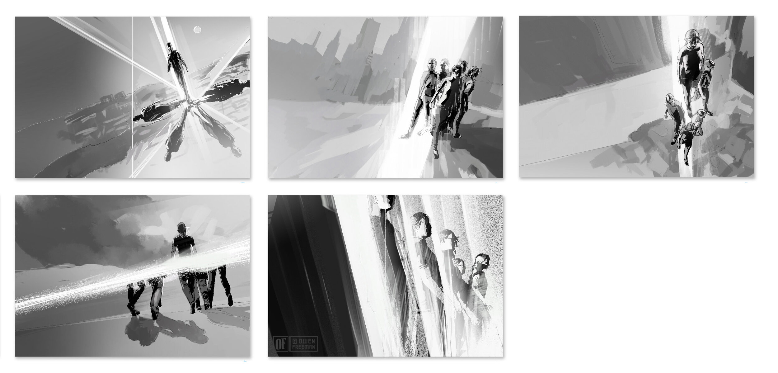
studies, etc. I had yet to use it for a full illustration but since I spent the most part of last month travelling, I had the opportunity to put the device to the test and now return the review-favor. Here are a few photos and notes on my experience with the Surface Pro 2 as an illustration tool for the New Yorker piece “Labor Day.”
Surface Pro 2 travel setupThe Surface is a compact tablet – the 10.6" screen is only a few inches bigger than the sketchbooks I use regularly. The portability is great for working up roughs and thumbnails for assignments and pushing around digital paints, however, it is a bit more challenging to think big-picture or get precise line-drawings since the length/flow of drawing tends to bump up against the boundaries of the screen.

Pictured above is the basic work/travel setup I've taken on short trips up and down the west coast and overseas to London this past month. The form factor is still relatively small, even with these additions, and travels well. Pictured above is the Surface Pro, the stock Surface Pro Pen and white Modbook Pro Digitizer Pen,  a 5.25" x 8.5" Stillman & Birn (Epsillon series) sketchbook, and just inside the bag a pen case, the keyboard and stand. The Surface Pro weighs in at 2 lbs., which isn't bad for carrying around airports and train stations, but I wouldn't want to hold it for long periods while drawing and found myself wanting to apply a little more drawing pressure than the kickstand angle allows. I picked up Surface Pro Artist's recommended iKlip Studio Music Stand, which I now use all the time. The stand has a nice industrial build (I think it's primarily for musician's digital tablets) and it has multiple angles and grabby rubber feet that give it a sturdy base on any table.

Surface Pro 2 travel setup
Because I've become accustomed to the two side buttons and eraser on the Cintiq pen, I found the stock Surface pen underwhelming, and was glad to discover the Modbook Pro Digitizer Pen, which comes with a range of Wacom nibs and includes two programmable buttons and an eraser. I have noticed slight shifts in the precision on each digitizer pen I've tried. I don't know if it is the calibration drivers or the sensors in the pens, but as I got into detailing more precise work, I felt the Microsoft pen registered slightly tighter than the Modbook.

I initially contemplated getting the Type Cover 2 keyboard to also act as a cover, but ultimately went with the Microsoft Wedge bluetooth keyboard as I keep the keyboard off to the left of the screen for shortcuts while working.

The New Yorker: Labor Day
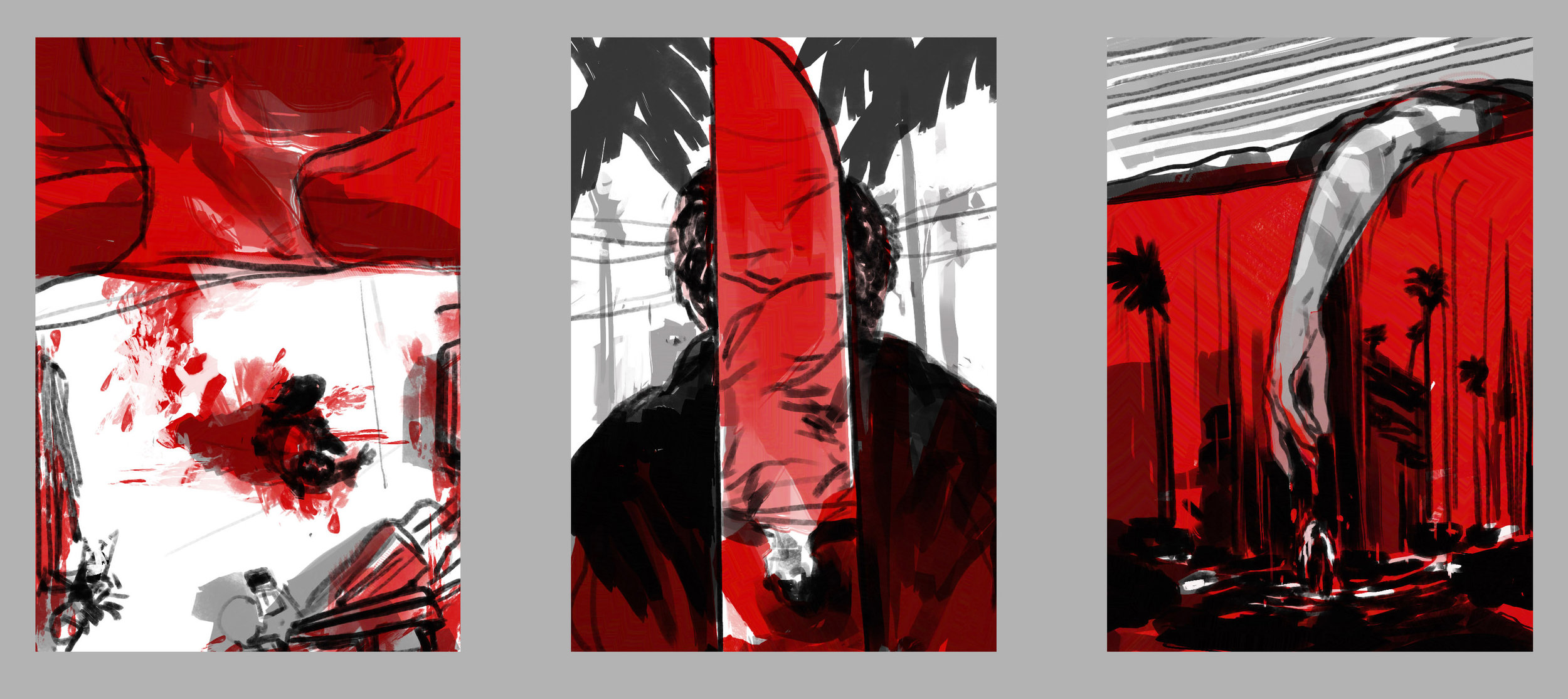
I got a call from The New Yorker about a quick-turnaround illustration when I was away from the studio over the holidays with only the Surface and my sketchbook, but having worked up elements of previous illustrations on the Surface, this felt like a reasonable test. The sketches were done in Photoshop, and then I went straight into the final drawing in Manga Studio. This turned out to be the trickiest part since the screen can feel a bit cramped when doing more gestural line work, so I tried to work around this by drawing slightly faster and adding a little more snap-correction to the pen in Manga Studio. The painted elements and colors were done in Corel Painter and fine tuned in Photoshop before being turned in the next morning. (The film is Jason Reitman's "Labor Day," review/illo in this week's New Yorker.)
The New Yorker: Labor Day
Overall I have to say the Surface Pro 2 has delivered nicely. I'm not sure why Microsoft isn't marketing its Wacom digitizer screen more prominently, but the 1,024 levels of pressure sensitivity are on par with their Intuos tablets, the processor has been keeping up with everything I've thrown at it, and simply being able to run full desktop Photoshop, Manga Studio etc. at the size of a sketchbook adds up to a really handy digital illustration tool.

The New Yorker: Fruitvale Station

The New Yorker: Fruitvale Station
Last week I worked on a cinema illustration for this week's New Yorker. The film "Fruitvale Station" is based on the events leading up to the murder of Oscar Grant in 2008 at the Fruitvale BART station in Oakland. The assignment deadline was tight (a day and a half start to finish), but having just moved to the East Bay and due to the gravity of the story, I felt I would be remiss if I didn't take the train down to take reference of the actual space and architecture where this really happened.

Sketches below were rough designs of different narrative elements closing in on Grant (as played by Michael B. Jordan) and I'm glad in the final I was able to involve other passengers and community awareness in the scene. AD Chris Curry.
The New Yorker: Fruitvale Station

The Washington Post: RCE

The Washington Post: RCE  
This month's Medical Mystery column for The Washington Post follows a woman whose undiagnosed Recurrent Corneal Erosion Syndrome (RCE) led her through an excruciating sleepless search for answers. The most vivid symptom of RCE is the inability to separate the cornea from the eyelid, which inspired the composition ideas below before going to the ink and digital illustration above. AD Lisa Schreiber.The Washington Post: RCE Sketches