llustration for The New Yorker review of American Crime Story: The People vs. O. J. Simpson. AD Chris Curry.
The New Yorker

The New Yorker: Eclipsed
Art Director Deanna Donegan called me last week for an illustration to accompany a piece about the play Eclipsed. Written by Danai Gurira, the play features Lupita Nyong’o in her Broadway debut. It follows the story of four captive wives of a rebel general during the last days of Civil War in 2003 Liberia.

The initial hook of this piece is Nyong’o’s New York stage debut. When I got the assignment, researching the stage play quickly gave way to researching the Liberian Civil War and absorbing as much documentation of that experience as possible. The playwright made a comment in an interview that she saw the violence of the war as a passing darkness eclipsing the light of their lives; that the darkness was transitional. I wanted to invoke that idea in the illustration and to represent the tension of the characters and their experiences as the war drew to an end.

The stills I came across from former stage productions of Eclipse revealed a sense of close-quarteredness that piqued my interest. I wanted to capture the essence that emerged from both aspects of research, while presenting an image that reads clearly in a small format.
I enjoyed the room for theatricality in this assignment. The theatre provides a controlled, heightened environment. In illustrating a dramatization there is often a bit more breadth to experiment with lighting and color in a fun way, and to evoke a more stylized aesthetic. Deanna, as always, was wonderful to collaborate with, trusting my input, and allowing me to experiment.

Nexus - Illustration for Maverick’s opening concert by Nexus Percussion.
The New Yorker: Nexus
In most cases I have a working familiarity with the subjects I'm asked to illustrate. However, for this New Yorker assignment on the opening Maverick Concert by the percussion group Nexus, I was unfamiliar with both the concert hall and the musicians.
This can often be a great help since, particularly in a short deadline, since the research and sketches tend to grow around each other and the preconceptions are minimal. Sargent's "Rehersal of the Pasdeloup Orchestra" was running through the back of my mind, especially the focus on the percussion and the lost-and-found instrument details.
Art Director Deanna Donegan and I discussed architecture of the concert hall playing a role in the drawing, so the cast light through the uncommon windows became a theme in the preliminary sketches.

The New Yorker: Gone Girl

I was out of town when I got the call asking about illustrating a piece on David Fincher's upcoming Gone Girl for The New Yorker, but by the time I was halfway through the walls-closing-in noire trailer I realized this was one of those assignments I was already sketching out ideas without having even said yes.

The great public specter looming over Affleck's character struck me as the stuff of great pulp covers, so the sketches began to take a turn towards the more theatrical devices of Norman Rockwell's "Razor's Edge" and Allesandro Biffignandi's "The Day the Sky Exploded." Ultimately, Rene Peron's graphically brilliant work on "The Passion of Joan of Arc," set the tone for the homage to the great pulp classics and cinema posters.

The issue hits stands this week, and Christoph Niemann's cover is brilliant. Thanks as always to AD Chris Curry.
The New Yorker: Night Moves
 Illustration for The New Yorker review of director Kelly Reichardt’s film “Night Moves.” AD Christine Curry.
The New Yorker: Blue Bloods

I love horseshoe crabs. It might be their quiet witness to half a billion years on earth, or the fact their hearts pump a singular amebocyte that defends their blood from pathogens, or the fact they can't be raised in captivity yet are preciously harvested by pharmaceutical companies. Horseshoe crabs are fascinating.
I wish I could claim that my interest in them predated the piece by Ian Frazier but it truly started after Christine Curry from the New Yorker sent me the article to illustrate. Once I read the story and began researching and drawing horseshoe crabs it was hard to stop. Below are some of the development sketches, exploring different ways to try to do these orthropods justice. Did I mention they swim upside down?

The New Yorker: The Unknown Known
 Illustration of Donald Rumsfeld for The New Yorker preview of Errol Morris' new documentary "The Unknown Known." AD Jordan Awan.
The New Yorker: Phillip Seymour Hoffman

An unpublished illustration of the late Phillip Seymour Hoffman for The New Yorker.
Surface Pro 2

A few months ago I ordered a Microsoft Surface Pro 2. My needs were modest but specific -- to be able to produce sketches and revise illustrations outside the studio without adding much weight to my travel set-up. I’ve enjoyed the portability and simplicity of the iPad but it is dwarfed by the performance of my Cintiq. So when in the market for a laptop+tablet "travel" combination, I knew I needed a machine with a very particular set of skills.
After reading some write-ups on the Surface Pro and its Wacom screen performance, especially from digital artists, I ordered a 256GB Pro 2 in November and have been using it for roughs, sketches, studies, etc. I had yet to use it for a full illustration but since I spent the most part of last month travelling, I had the opportunity to put the device to the test and now return the review-favor. Here are a few photos and notes on my experience with the Surface Pro 2 as an illustration tool for the New Yorker piece “Labor Day.”
 The Surface is a compact tablet – the 10.6" screen is only a few inches bigger than the sketchbooks I use regularly. The portability is great for working up roughs and thumbnails for assignments and pushing around digital paints, however, it is a bit more challenging to think big-picture or get precise line-drawings since the length/flow of drawing tends to bump up against the boundaries of the screen.
Pictured above is the basic work/travel setup I've taken on short trips up and down the west coast and overseas to London this past month. The form factor is still relatively small, even with these additions, and travels well. Pictured above is the Surface Pro, the stock Surface Pro Pen and white Modbook Pro Digitizer Pen, a 5.25" x 8.5" Stillman & Birn (Epsillon series) sketchbook, and just inside the bag a pen case, the keyboard and stand. The Surface Pro weighs in at 2 lbs., which isn't bad for carrying around airports and train stations, but I wouldn't want to hold it for long periods while drawing and found myself wanting to apply a little more drawing pressure than the kickstand angle allows. I picked up Surface Pro Artist's recommended iKlip Studio Music Stand, which I now use all the time. The stand has a nice industrial build (I think it's primarily for musician's digital tablets) and it has multiple angles and grabby rubber feet that give it a sturdy base on any table.

Because I've become accustomed to the two side buttons and eraser on the Cintiq pen, I found the stock Surface pen underwhelming, and was glad to discover the Modbook Pro Digitizer Pen, which comes with a range of Wacom nibs and includes two programmable buttons and an eraser. I have noticed slight shifts in the precision on each digitizer pen I've tried. I don't know if it is the calibration drivers or the sensors in the pens, but as I got into detailing more precise work, I felt the Microsoft pen registered slightly tighter than the Modbook.
I initially contemplated getting the Type Cover 2 keyboard to also act as a cover, but ultimately went with the Microsoft Wedge bluetooth keyboard as I keep the keyboard off to the left of the screen for shortcuts while working.

I got a call from The New Yorker about a quick-turnaround illustration when I was away from the studio over the holidays with only the Surface and my sketchbook, but having worked up elements of previous illustrations on the Surface, this felt like a reasonable test. The sketches were done in Photoshop, and then I went straight into the final drawing in Manga Studio. This turned out to be the trickiest part since the screen can feel a bit cramped when doing more gestural line work, so I tried to work around this by drawing slightly faster and adding a little more snap-correction to the pen in Manga Studio. The painted elements and colors were done in Corel Painter and fine tuned in Photoshop before being turned in the next morning. (The film is Jason Reitman's "Labor Day," review/illo in this week's New Yorker.)

Overall I have to say the Surface Pro 2 has delivered nicely. I'm not sure why Microsoft isn't marketing its Wacom digitizer screen more prominently, but the 1,024 levels of pressure sensitivity are on par with their Intuos tablets, the processor has been keeping up with everything I've thrown at it, and simply being able to run full desktop Photoshop, Manga Studio etc. at the size of a sketchbook adds up to a really handy digital illustration tool.
The New Yorker: Nightmare Alley

I’ll be at the Alternative Press Expo this weekend in San Francisco alongside Chris Koehler and Alejandro Larin with some small art books and prints (including this unpublished illustration for The New Yorker on the MoMA screening of the Tyrone Power noire “Nightmare Alley.” AD Jordan Awan.)
Also for anyone wondering why this blog is much quieter, I have migrated to an Tumblr blog within my site and posting new work primarily there and on Facebook. Thanks!
The New Yorker: Fruitvale Station

Last week I worked on a cinema illustration for this week's New Yorker. The film "Fruitvale Station" is based on the events leading up to the murder of Oscar Grant in 2008 at the Fruitvale BART station in Oakland. The assignment deadline was tight (a day and a half start to finish), but having just moved to the East Bay and due to the gravity of the story, I felt I would be remiss if I didn't take the train down to take reference of the actual space and architecture where this really happened.
Sketches below were rough designs of different narrative elements closing in on Grant (as played by Michael B. Jordan) and I'm glad in the final I was able to involve other passengers and community awareness in the scene. AD Chris Curry.

The New Yorker: Mastiff


The New Yorker: Much Ado About Nothing

Last week I got a call to illustrate The New Yorker film review of Joss Whedon's "Much Ado About Nothing." The lead review changed at the last minute and the piece did not run. Nevertheless, I enjoyed working with a limited palette and playing up thematic elements from the film in the composition. AD Chris Curry.
The New Yorker: Mexican Manifesto

Short fiction is a great well to draw from, and Roberto Bolaño is always a fascinating and disorienting author to illustrate. Above is a full-page illustration for the Mexican Manifesto piece in this week's New Yorker, and below are the thumbnail ideas and slightly more developed composition sketches. AD Jordan Awan.

The New Yorker: To the Wonder

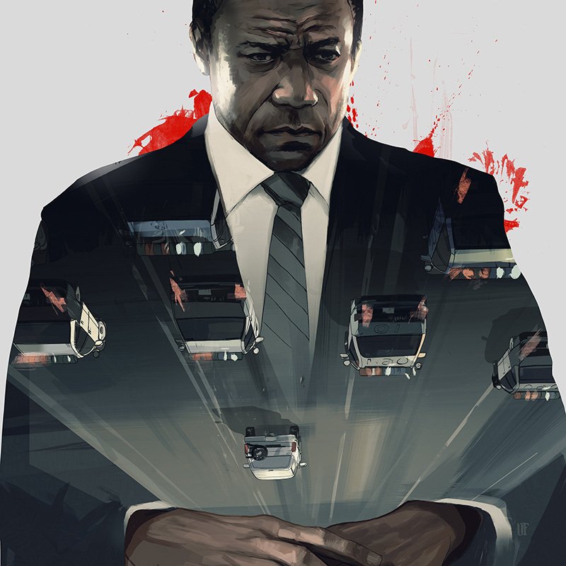
The New Yorker: Flight

I got a call from The New Yorker to illustrate this week's review of Robert Zemeckis's new film "Flight" starring Denzel Washington. Even though I only had access to a few interviews and trailers, I enjoyed the challenge of keeping things simple and a bit more iconic in the sketches.
Much thanks to AD Chris Curry.
![The New Yorker: Flight [sketches]](http://farm8.staticflickr.com/7265/8156858309_c59f0a1ba5_o.jpg)
The New Yorker: Doctor Who

Getting assignments to work on something you're a fan of is always fun, but getting to work on something that you become a fan of while working is especially cool. I got a call from The New Yorker to illustrate a Doctor Who piece by Emily Nussbaum for the Sci-Fi issue and immediately regretted having put off watching the series. However, there's a lot to be said for being immersed in an entirely new subject while sketching and, in the case of the Doctor Who series, the only real visual struggle was editing down the wealth of great locations and monsters. Below are some of the unused rough sketches and the four sketches I cleaned up to submit. Thanks again to Chris Curry for the consistently fun assignments, and to the BBC for an exceptionally smart show.

